10 Tips for Optimising your Hotel Website
Hotel and general accommodation websites can be much of a muchness. They are basically slideshows with images, bullet-point lists of features and a “Book Now” call to action. To stand out you need to engage, build aspiration and make the process as simple as possible.
Here are 10 areas you can look at that address various facets of your online accommodation website and marketing presence.
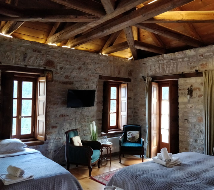
It’s a bit dark, what’s that on the wall?
(A picture is worth a thousand words)
Imagery should highlight the quality of your rooms and services. Modern image compression software allows for maximum quality with minimum size (remember page speed is important). Also remember the images should be honest (no fish-eye lens please), beautifully lit and welcoming.
The more the merrier! A TripAdvisor study showed that:
- Properties with at least one photo receive a 138% increase in engagement and a 225% increase in the likelihood of a booking enquiry.
- Properties with over 100 photos receive a 151% increase in engagement and a 238% increase in the likelihood of a booking enquiry.
So, both quality and quantity play a part, professionally taken photos can capture the essence of your property along with the small embellishments that make it stand out.
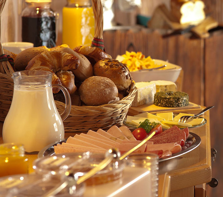
It’s just a hotel room
(Create an emotional connection)
Or rather, why should I stay in your hotel?
All hotels have rooms, all hotels have services. What connection can you make between your visitor and your hotel/accommodation experience? Does your hotel offer something different? Make sure you let the visitor know.
Room and services descriptions should be informative but also aspirational, you’re hotel may not be as luxurious as Gramercy Park Hotel, but you will have features that are worthy of highlighting. Tell a story, allow your visitor to see themselves having a great time – the more you do, the higher the chance of a completed booking.

So much choice, where do I start?
(Why less is often more)
You know when you are busy and you want to maximise revenue, but don’t make the mistake of giving the potential customer too many options to choose from. Multiple room packages, seasonal specials etc. all add to the complication of bookings. Guide the visitor to your “best” room packages, build a UI that provides a simple and logical way to distinguish between them. Remember every extra click is a click away from eventual conversion and once they are gone, they rarely return.
In ‘The Paradox of Choice – Why Less Is More’, Barry Schwartz argues that eliminating consumer choices can reduce shopper anxiety. A great example of this is the supermarket giant Aldi, offering far fewer variations of each product has seen them achieve a large market share. This has even led to a rethink from opposing supermarket rivals. See this article from news.com.au on the subject

Feels a bit clunky
(Small things are getting bigger)
Responsive design has been around for a long time now. Even though the move towards smartphones has gathered pace, conversion rates are still skewed heavily towards desktop for actual bookings. This is changing, but if we look at the Monetate Ecommerce Quarterly figures we can see that mobile conversion rates are 1/3 to 1/4 that of desktop/tablet devices. So mobile is still more of a browsing and fact-finding device, but that point of contact is invaluable to your final funnel bookings. And of course, the conversion rates for mobile will continue to rise as devices and users change over time.
If a visitor comes to your site on a mobile phone, do you present a fantastic UX that allows them to move naturally around using the gestures and navigation that they are used to? If not you run the very real risk of losing them as a potential customer, bad UX equals bad customer service?

That’s a lot of questions…
(Keep it clean and simple)
Look at your booking process, look at all the questions and information you ask for. Is it all needed? Sure, marketing would love to know how they found the site etc. but if that one extra question reduces your booking conversion rate would you still ask it? What do you really need for a successful booking? At its simplest you need to know:
- What room the customer would like
- When they would like it
- The customer’s name and email
- Payment info
What else are you asking and why? Sometimes the biggest wins are seen by removing content rather than adding content.
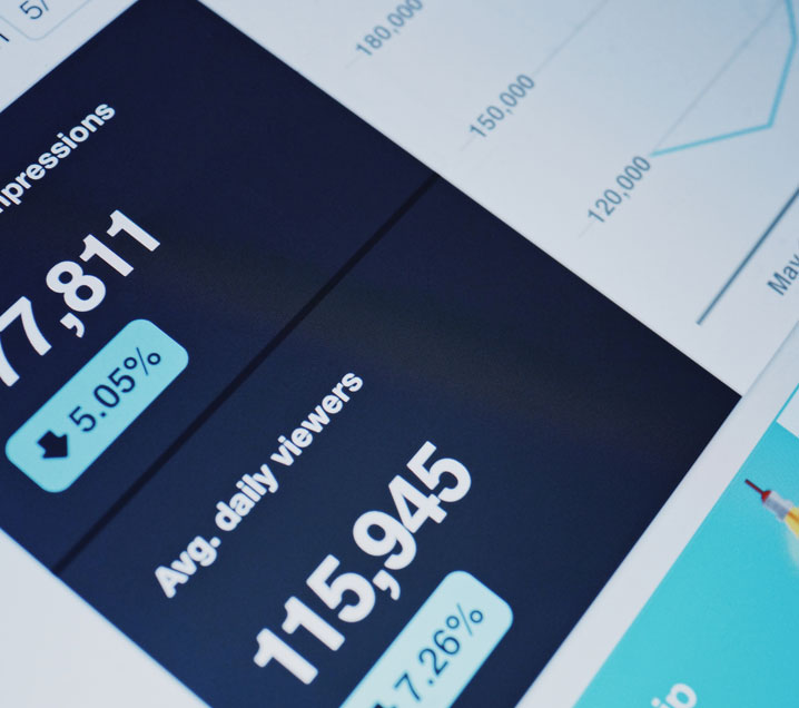
Surely you know what I like?
(Data is your best friend)
You’re probably swamped with data. Visitors, referrers, bounce rate, landing pages – all of these help you to understand where your visitors are going and where they are leaving. It’s important to understand these insights and make actionable decisions. If a page shows a high time on page or bounce rate, what is causing it? Come up with a hypothesis, an idea to solve the problem and test it.
This can be the most intimidating step of your journey to a website that converts better, but we love analysing big data to identify ways to give your website a distinct competitive advantage.
Why am I seeing this email?
(Relevancy)
Making the most of your email marketing is another key area. One bad email can lead to an unsubscribe or the dreaded “spam” classification. Making the email relevant is essential, imagery and copy should be tailored to your visitors. Here again, testing is invaluable, identifying winning combinations of content.
A great example of this is for a case study from Selligent on cooking.com that demonstrated a 500% lift in open rates and an increase in click-through rates which went from 1.3% to 7.68%.
Click where?
(Be obvious, set direction)
Strong and compelling Call to Actions (CTAs) are one of the most important visitor interaction elements and one of the simplest to test. You spent a fortune designing a great looking landing page that captures the essence of your property and then stuck a button on the page that says, “Click Here”. Did you think about where it was positioned on the page, the colour, the size, the text? If not, you are probably losing valuable engagement opportunities which will never be recovered.
A clear CTA which helps the visitor through to the next stage of their journey with you will ensure a great flow through your search and booking processes. CTAs that use more targeted text have proven to convert better. A Hubspot analysis saw a 42% lift in converting visitors into leads using targeted CTAs. Not a hospitality-based insight, but surely worth investigating and testing?
How popular are you?
(Social proof)
Social proof is one of the best “pushes” towards online conversion you can get (as long as you have a good social profile!). Ratings and reviews displayed in the right places at the right time add confidence and weight to your online content, remembering, of course, to not over clutter the visitor experience.
Celebrity endorsements or praise from social influencers, awards and certificates all add to this social reinforcement and lift your trust status. You just need to know when and where to use them.

What else have you got?
(Go that extra mile)
Your visitors are coming to your hotel for a reason, not just to stay in your hotel – however beautiful it may be. Demonstrate your knowledge and understanding of your area, be a location expert. Blog posts about places to visit and to eat demonstrate your expertise.
Partnerships can be invaluable, both in converting your visitors and opening up a whole new referrer network. Is a local tourist attraction that you could partner with and offer reciprocal discounts? These are the differentiators that can be the difference between you and your competitors and aggregator sites.
These are just some of the strategies that we use when building an optimisation program for our clients – it can be very daunting, but it is all very achievable with the right team and expertise.
